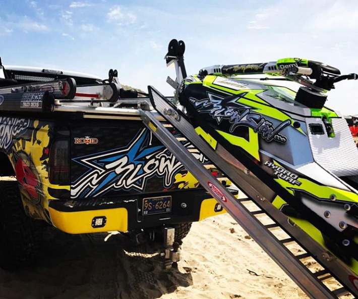
TruckBoss Truck Decks’ website has a new look for 2018. The development team did a great job building a new and improved user friendly site. It’s clean, colorful, and easy to navigate. We really like that the team put a lot of effort into the TruckBoss brand. The images are stunning and the drop down menu provides a page of links to take you where you want to go. The website is functional and uncluttered. A live chat was added as well. That’s a nice touch.
The “how to” videos are labeled and easy to find. The step by step instructions provided by the TruckBoss staff are fairly easy to follow and understand. Their spoken guidance is much easier to follow than the printed instructions provided by Ikea or most others in the DIY business.
Another nice feature are the icons located at the top of each page. They include an UTV, ATV, Motorcycle, Snowmobile, and a Personal Watercraft. These make it simple to browse, especially if a shopper wants to check out multiple items. It’s easy to go between them.
The pages load fast and the text is easy to read. The website really stands out. Whereas, prior to the new design, it was a little difficult to navigate and not as bold. It was cluttered and filled with too much text per page. The designers also added a “Build & Price” button to each page. That button alone really cleaned things up. The company is still offering Bundles, only now,they’re neatly packaged for simpler viewing.
The new TruckBoss website is impressive and will make a person want to navigate to all the useful products and tools. Check it out for yourselves and let the crew at TruckBoss know your impressions.


